How To Create A Color Palette For Your Brand
Creating and implementing a color palette is one of the best ways to convey the mood of your brand. Building a cohesive color palette can be overwhelming because there are so many directions you can go. Before choosing your color palette, it’s important to define your brand’s personality so that you can choose colors that represent it well. In this post, I’m going to walk you through the steps you can take to create a color palette you love.
1. Take note of your favorite colors
Look at websites and brands that you are attracted to, pay attention to the colors they use. Are they bright and bold, or muted and neutral? Knowing what your personal preferences are is the first step to creating the perfect color palette. While you want your brand colors to represent your business, if you really hate the color purple, that’s good to take note of now.
2. Pick colors that match your brand’s personality
If you describe your brand as strong and luxurious, you’ll want to stay away from delicate pastels such as lavender and look for more intense colors like dark icy blues and metallics. If your brand is bright and punchy, it makes sense to incorporate a bold fuchsia to use as an accent color.
3. Start Pinning
Hop over to Pinterest and start a new brand colors board. You can start by searching terms like “bold color palette” to get your inspiration flowing. Experiment searching broad colors like red and then try narrowing it down to coral red. Don’t limit yourself at this stage, pull anything that you are attracted to and you’ll narrow it down in the next step. TIP: Try adding the words “aesthetic”, “photography”, or “color palette” to your Pinterest search. For example, rather than just typing in “red”, type “red color” or “red aesthetic”. That will give you more stylized photography versus just a page full of items that are red.
4. Narrow it down
Usually at this point I try to step away from the project for at least a day. Give yourself some time and come back to it with fresh eyes. Go back through your Pinterest board and pull images that feature your favorite color palettes. I like to choose multiple images and create a full inspiration board, but you can also choose one image to build your palette from. If you’re using Adobe InDesign, Illustrator, or Photoshop, you can open your image in one of these programs and use the eye dropper tool to sample colors directly from the image. Keep in mind you need to have a range of colors including a darker option for text, and a “pop” of color for buttons or calls-to-action.
5. Bring it all together
When I work with clients on their new brand, I like to create a brand board to visually display all the elements in one place. Now that you have your color palette, you can create your palette by simply drawing shapes (such as circles or squares) and filling them in with your colors. I also like to include the color codes for consistency across print and digital materials.
If you need help getting clear on your brand traits, I go through this step by step in my Brand Clarity Workbook. Download your free copy today to get super clear on your brand personality, and get even more color palettes and font combinations!

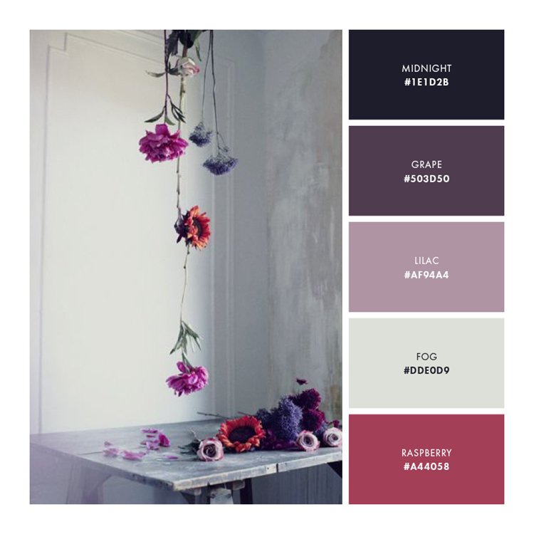
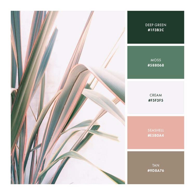
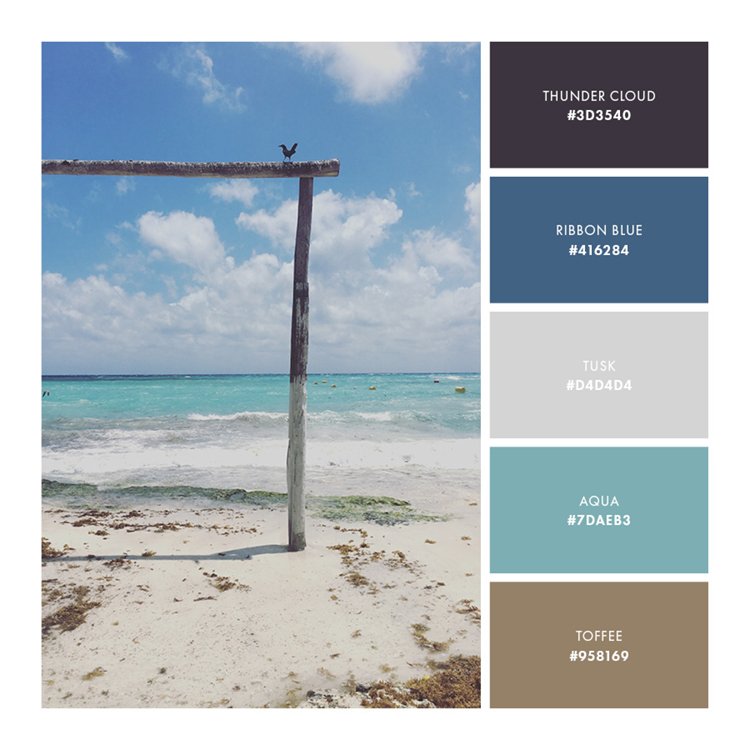
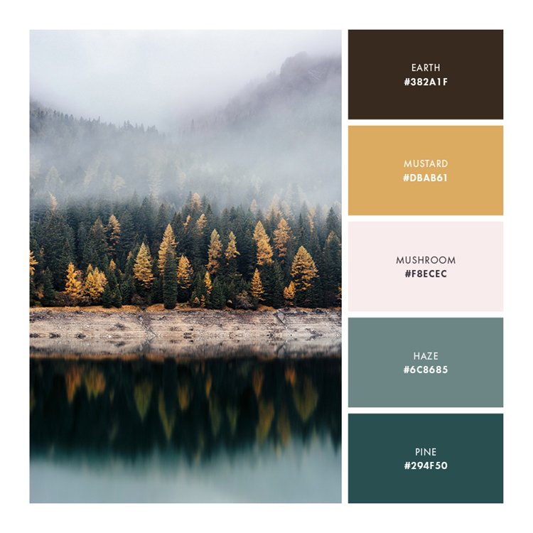
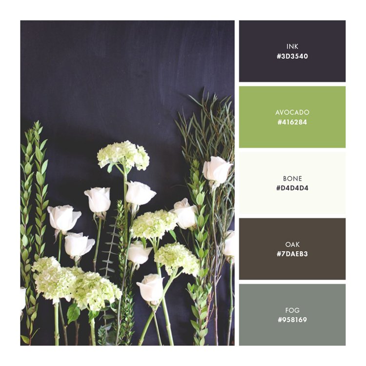
Here are a few sample color palettes for you to use as is, or as inspiration to build a new palette unique to you and your brand!