The First 3 Things Visitors Want To See On Your Homepage
First impressions are huge when it comes to your website. Studies have shown that visitors decide within 10 seconds of landing on your website if they will stick around or not. While your visuals and layout design play a role, there’s a few basic questions that you can answer right away that will keep your ideal clients on your site.
Even if someone comes to your website through your blog or another page, chances are they’ll head over to your homepage to see what you’re all about. For this reason, you have a huge opportunity with your homepage to make sure visitors are sticking around and taking action.
When someone lands on your homepage, in those precious 10 seconds, these are the very first things they are going to be looking for:
1. What do you do?
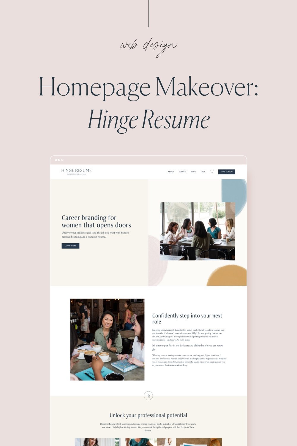
You’ve got to make it super clear what you do and what you’re selling. This is best done with words paired with a photo or image representing what you do. If you’re a nutrition coach, say that and use a photo of you surrounded by nutritious food. If what you do is less literal, for example, a relationship coach, a photo of you smiling is a great option. What you don’t want to do is use a photo of you doing something unrelated like yoga or painting. That can create confusion and leave visitors thinking, ‘is this woman a yoga teacher? Or maybe she sells paintings?’ You can also use brand photography here, for example, if you are an esthetician, you can choose a header image that represents that, it doesn’t necessarily have to be you working with a client.
2. Can you help me?
At the same time they’re looking for what you do, your visitor is deciding if they need what you’re offering and if you can help them. You don’t want visitors to have to search for this information, make it clear and easy to find right away on your homepage.
A few ways you can show who you help:
A clear value proposition: your value proposition is a concise statement explaining how your service solves a problem or what specific benefits someone can expect from working with you.
Show testimonials and social proof of people just like them that you’ve helped.
Show a portfolio of past work (this one is optional, if it makes sense for your business)
3. What do I do next?
This is where mapping out your user journey comes in handy. You want to make it super clear where you want your visitor to go next. You can do this by highlighting a call to action on your homepage or for some businesses it makes sense to create a ‘Start Here’ page. The key here is to not overwhelm visitors with options. If you have multiple calls to action on your homepage, make sure they are spread out into sections so that there’s not more than one call to action (CTA) in each section. For example, one section on your homepage might highlight you services and the CTA would be to learn more. The next section can showcase your recent blog posts where the CTA is to continue reading. To summarize, you should have one single call to action for each separate idea or topic.
If you want to learn more about the most important things to include on your website be sure to grab my Homepage that Converts Checklist that will help you create a homepage that is clutter free and converts more clients.


