3 Elements Of A Successful Website
Building a strategic and impactful website can be overwhelming. It’s a big project where making a plan is crucial. If you’ve built your website yourself, you know that starting from scratch (or even from a template) without a plan leads to unnecessary overwhelm and frustration.
If you’re wondering where to even start, I’m going over the three main elements you can have planned out before to feel confident you’ll have all the things you need to build a successful website.
These three elements all fit together like a puzzle. If one piece is missing, it can still exist, but it’s not as great as it could be. Here are the three main elements that work together to create a powerful website that converts:
1. Copy
Your copy is all of the text and words that live on your website. Obviously this piece is super important because you can have the most beautiful logo and color palette, but if your words don’t connect it’s basically pointless. Your copy should be concise and talk directly to your target market. Through design and layout, you’re able to arrange the words into paragraphs and sections that make it appealing and easy to digest.
2. Visuals
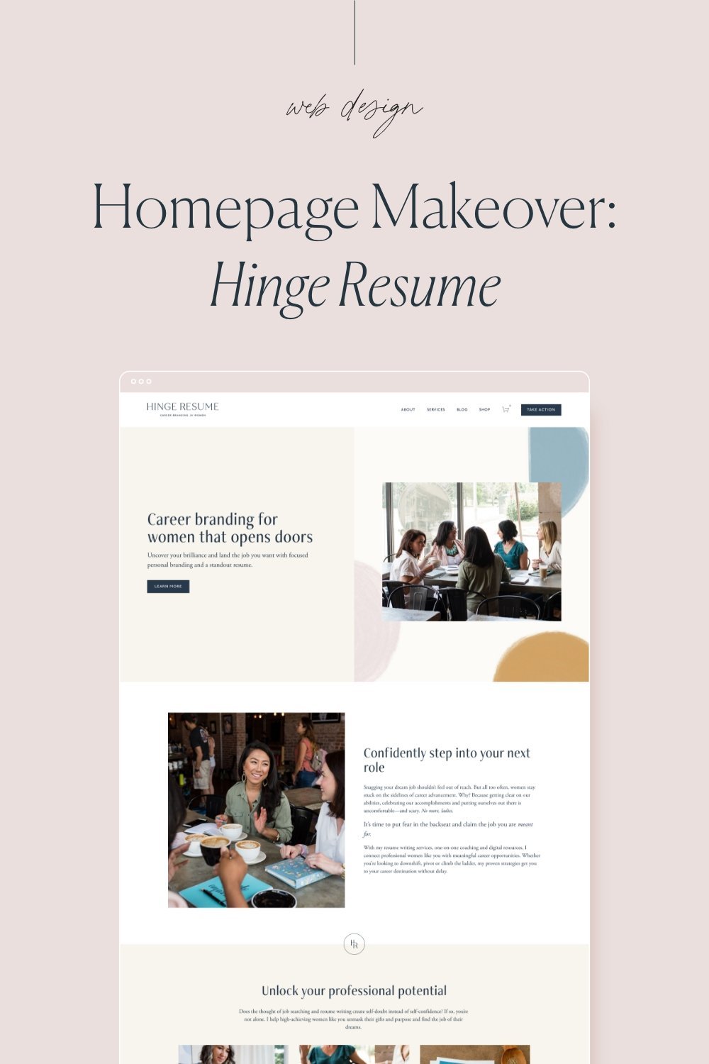
The visuals on your website include brand photography, brand colors, fonts, and any other design elements (think icons, graphics, etc.). The visuals are what help paint the picture that your copy is communicating.
When someone arrives at your website, they see the visuals first before reading the copy, and this might be a deciding factor in whether they stick around or not. Professional photography and consistent brand visuals help to build trust and show that you are running a legit business.
3. Structure/Layout
The structure of your site is how all of the copy and visuals are arranged. You wouldn’t just take all your copy and photos and dump it onto one page. Nobody would read that. The way your site is structured is super important because you can build it in a way that guides visitors through your website and invites them to take action.
Arranging your copy and visuals into sections allows people to find what they’re looking for and ignore the rest. When thinking about the structure of your site, you should limit the number of pages in your main navigation (I recommend 3-5 items max.) and always include calls-to-action on every single page. This makes it easy for visitors to explore and be led to taking action.
Diy-ing your website? If you need some help getting started, be sure to grab my Homepage that Converts Checklist. This free checklist goes over everything you should include on your homepage to inspire visitors to take action!


