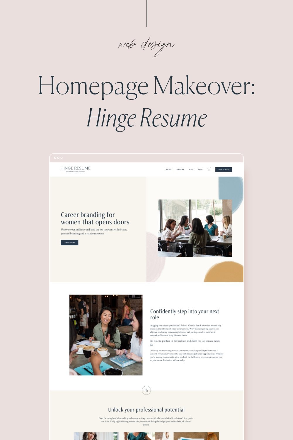
Homepage Makeover: Hinge Resume
An engaging, beautiful, and smart homepage is an important part of any strategic website design.
Meg already had a lot of the important content pieces on her homepage, but as you can see in the before image, it wasn’t very engaging or visually interesting. By creating and implementing a cohesive brand color palette, fonts, and imagery, her homepage was transformed from ‘blah’ to beautiful!
Meg also worked with a professional copywriter who was able to turn her words into engaging and easy-to-skim (so important!) copy.
Below, I’ll go into detail explaining each section and how it’s used to create brand consistency, build trust, and encourage visitors to take action. All of these elements work together to ultimately book more clients and grow your business.
Read on to learn exactly how I transformed the homepage for Hinge Resume…
1. Simple navigation
Limiting options creates an easy to use experience for website visitors. We guide people by giving them fewer options and highlighting the main call to action using a button.
2. Clear headline
We created a large headline that tells visitors exactly what this business does. We also included a call to action (CTA) right away to encourage potential clients to learn more.
3. High quality brand imagery
We show a group of women connecting here to reiterate who this brand is for and create a visual connection point.
4. Clear introduction
This intro section offers an in depth description, giving more information into exactly what Hinge Resume does and how Meg serves her clients.
5. Skimmable intro to services
This section gives a simple overview of the different services and ways someone can engage with the brand. A visitor can quickly skim over these options and easily choose one to learn more about.
6. Friendly portrait
Meg provides 1-on-1 services for her clients, so we want to show people exactly who they’ll be working with. Using a friendly, approachable photo here helps build trust and associate a person behind the business.
7. Engaging bio
We add a quick bio here to capture interest and invite visitors to learn more by linking to the about page.
8. Social proof
We had a variety of social proof including testimonials, media features, and companies that have employed past clients. Social proof like this is a powerful way to build trust and highlight expertise.
9. Final call-to-action (CTA)
Every page should end with an invitation to explore more. This encourages visitors to move through the site rather than exiting because they aren’t sure what to do next.
10. Footer
We included a simple newsletter form inviting visitors to subscribe, social media links, and other page links that didn’t need to be in the main navigation.
11. Legal pages
Always include a privacy policy and terms & conditions on your website.


